UnitedHealthcare's Data Visualization System
A strategic initiative integrating accessible data visualization into a healthcare design system.
Role
Led UX Design & Design System
Skills
Team Leadership, UX, Research, Design Systems, Data Visualization
Duration
Aug 2024 - Nov 2024
feedback Problem
The design system was restricted to donut and pie charts, forcing teams to create inconsistent, non-accessible one-off visualizations for bar charts. This fragmentation led to brand dilution across UHC and Optum and significant user confusion when interpreting critical healthcare business data.
target Goals
• Accelerate Interpretation: Empower users to quickly decode complex healthcare metrics.
• Scale Visualization: Introduce a library of reusable bar graph components for diverse data types across all products.
• Standardize Accessibility: Implement baked-in accessibility standards to ensure a unified, compliant experience.
bolt Impact
• 18% Support Drop: Reduced help center requests related to dashboard clarity within 30 days of launch (March 2025).
• Reduced Cognitive Load: Users reported a 17% reduction in data interpretation effort, validated via the NASA TLX scale.
• Rapid Enterprise Adoption: Successfully integrated into 81% of active teams (75 of 92) within just 6 weeks of release.
Research & Insights
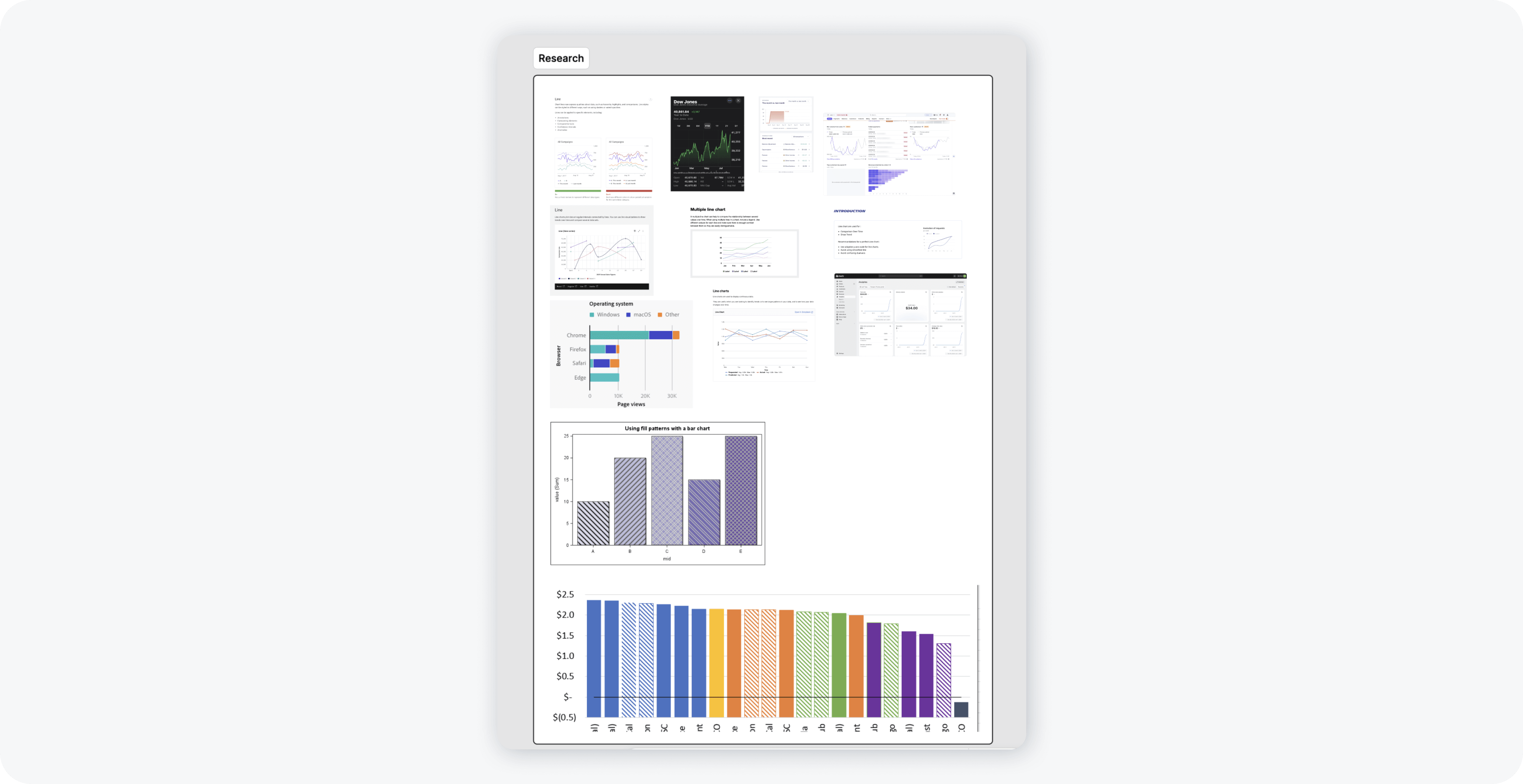
• We analyzed component usage across 200 teams and surveyed active users to identify needs for bar charts—several teams were making one off components.
• Benchmarking financial apps and leading design systems helped define best practices for accessible and clear data visualization.
• Research confirmed 92 teams actively relied on data visualization components, validating the strategic priority of this initiative.
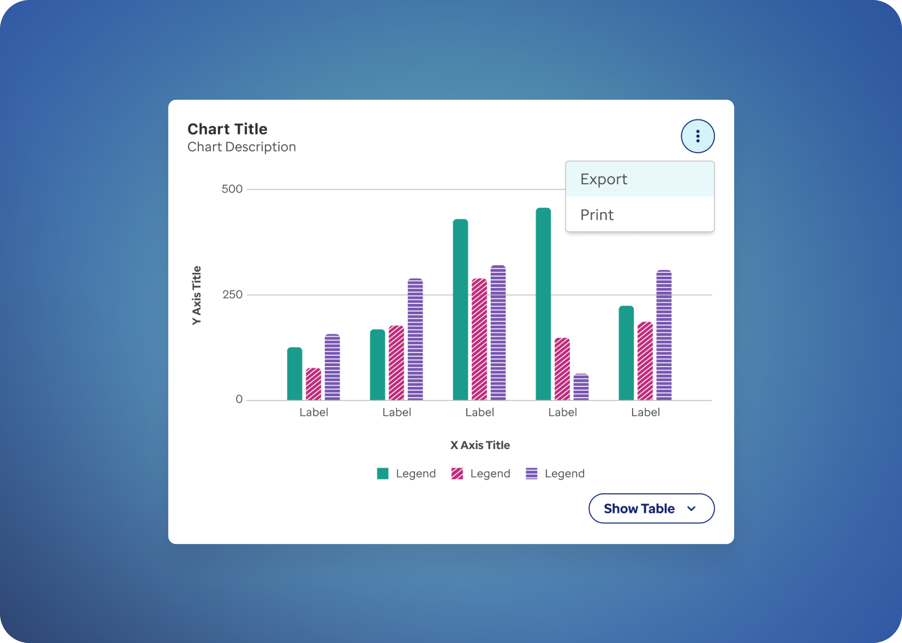
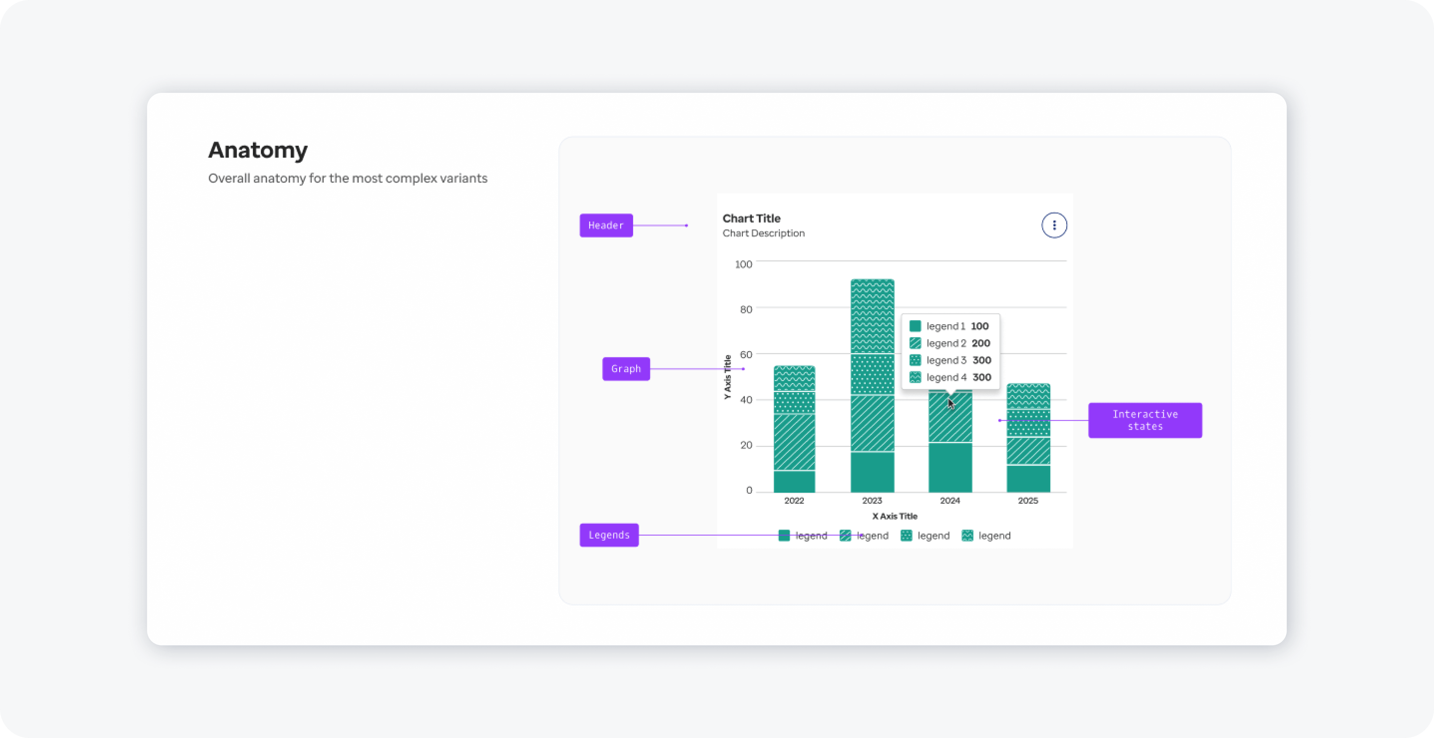
Design Approach: Patterns, Colors & Accessibility
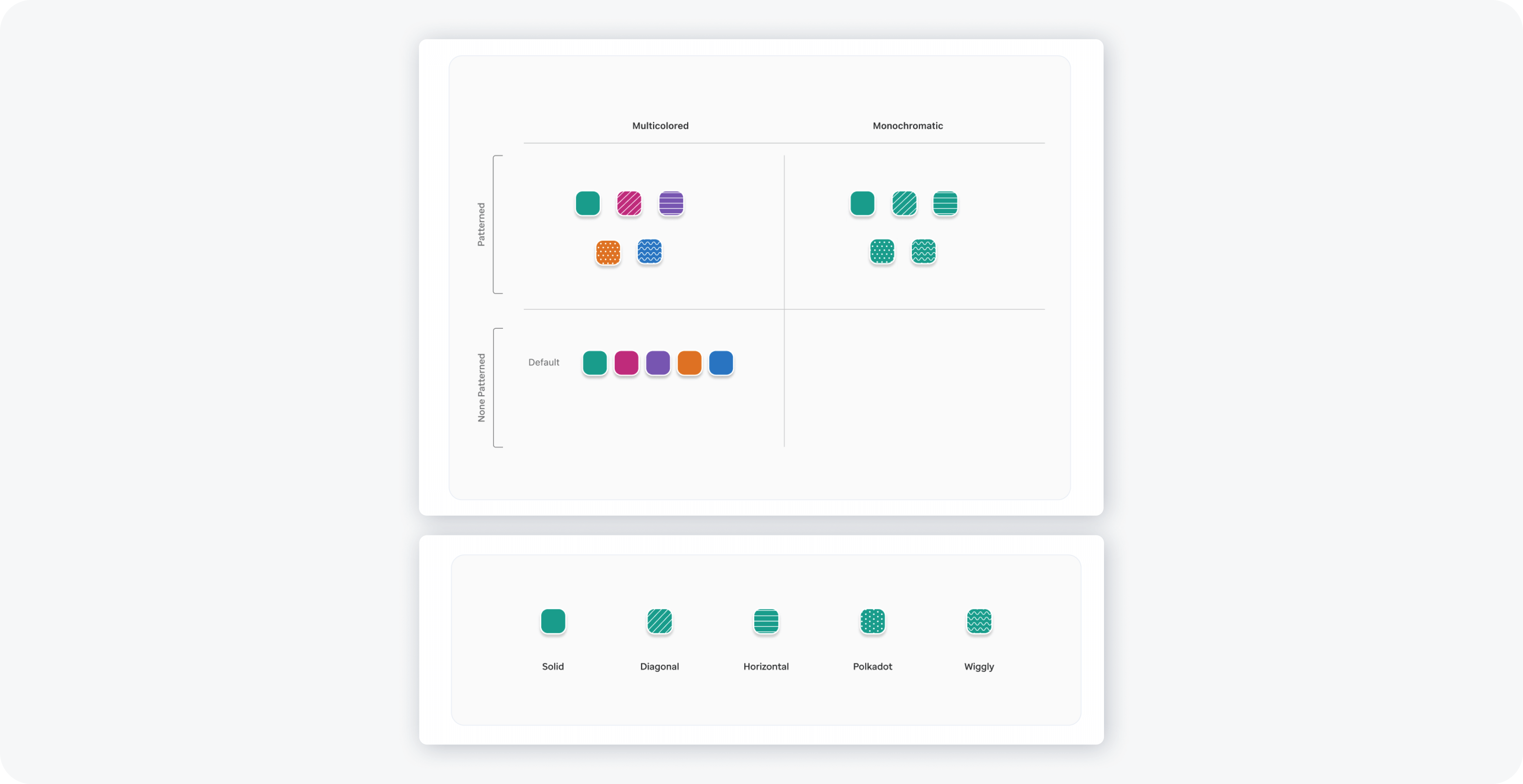
• We defined a color and pattern palette to ensure strong contrast and accessibility, enabling clear differentiation of multi-series bar charts.
• Iterative design tested patterns (solid, diagonal, horizontal, polkadot, and wiggly) for readability, particularly when color alone may not suffice. Legends were placed directly beneath charts for optimal clarity.
Together with the accessibility team, we identified three key principles to guide the bar chart design:
1. Do not rely on color alone: Use patterns, labels, or textures to distinguish data series—especially in multi-series charts—so information remains clear for color-blind users.
2. Ensure sufficient contrast and legibility: Bars, labels, and supporting UI must meet WCAG contrast requirements to ensure data is readable across lighting conditions and visual abilities.
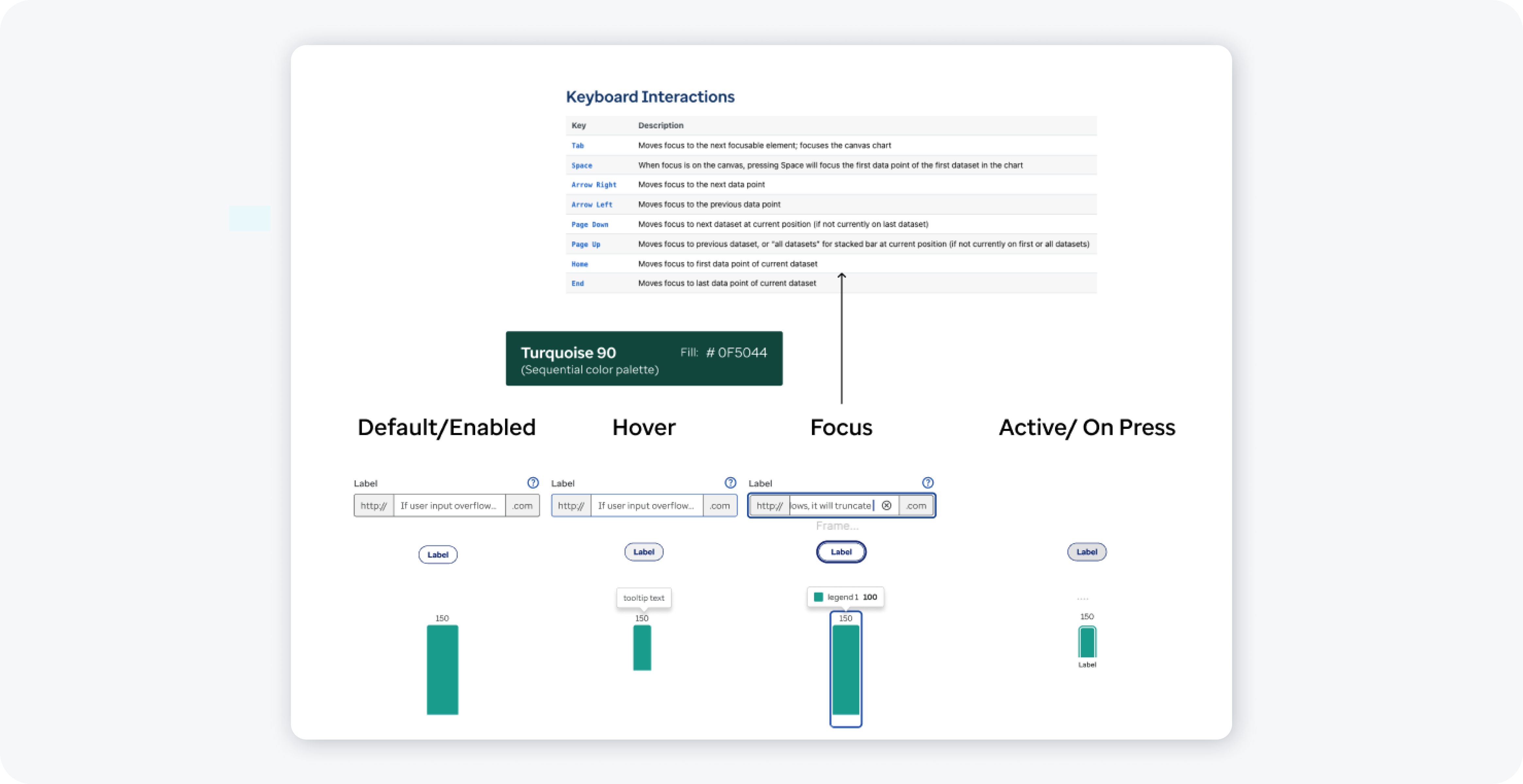
3. Provide clear focus states for keyboard navigation: Visible focus indicators on bars or datasets ensure charts are usable by keyboard and assistive technology users.
Working with the accessibility team, we explored also several variations in bar chart design, including color palette adjustments for contrast, patterned fills to differentiate multi-series data, legend placement, and spacing between bars for readability.
Interaction & Focus
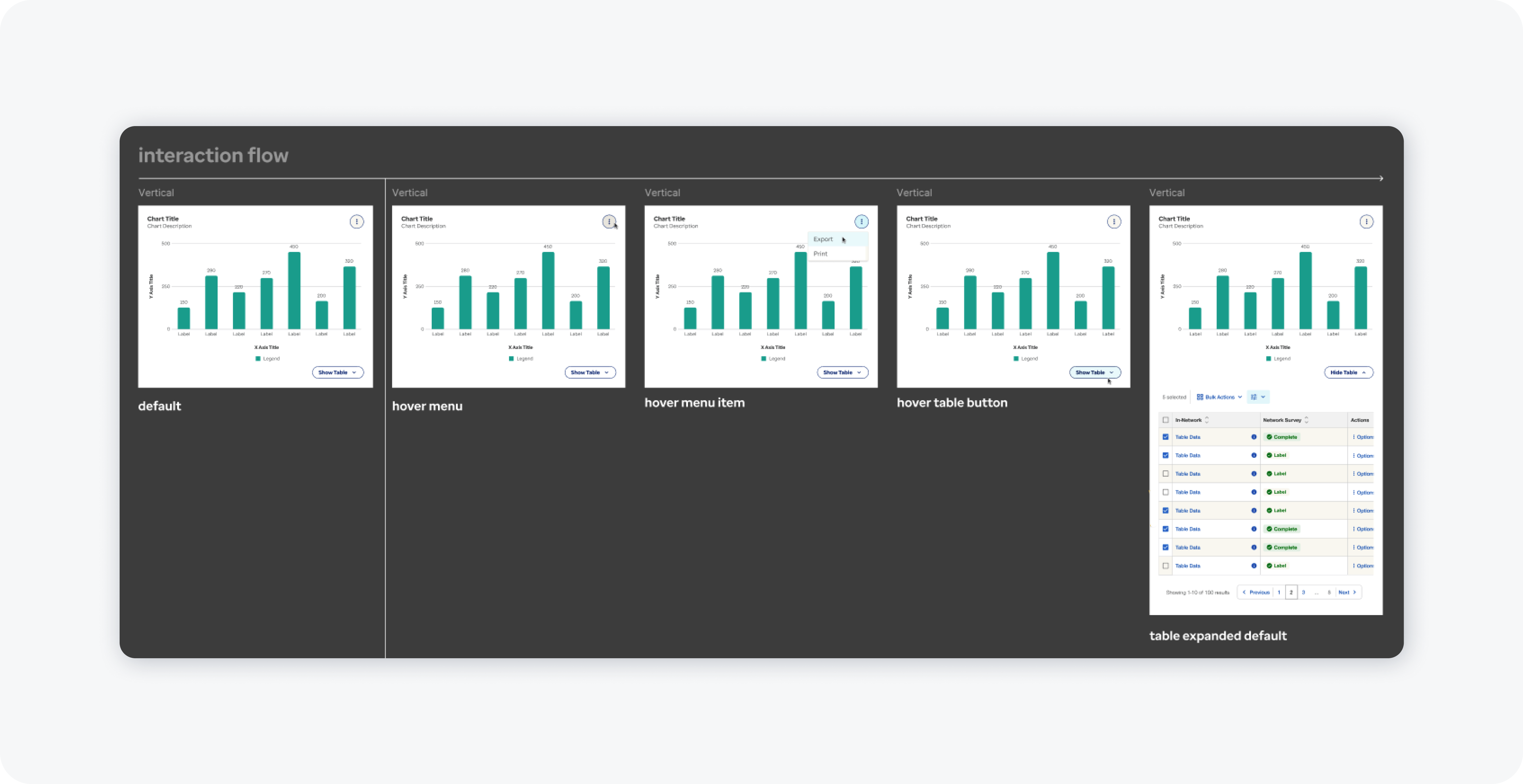
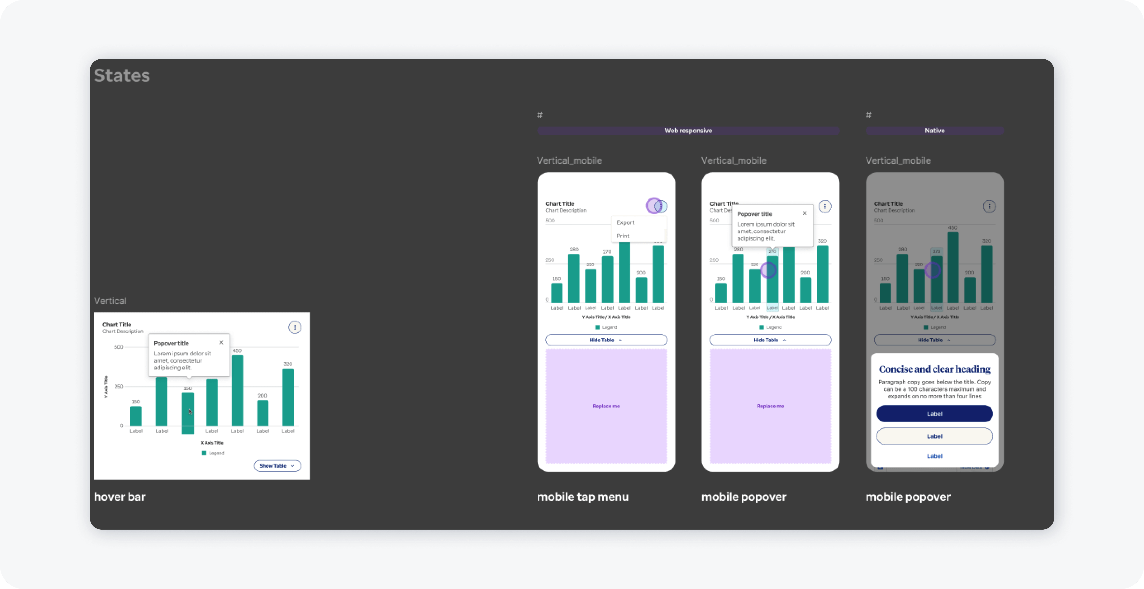
• Interactive behaviors included tooltips for precise data values and focus states for keyboard navigation and assistive technology users.
• Mobile adaptations, such as horizontal scrolling for wider charts, ensured usability across devices. Focus outlines around bars or datasets enhanced accessibility and navigability.
Documentation & Adoption
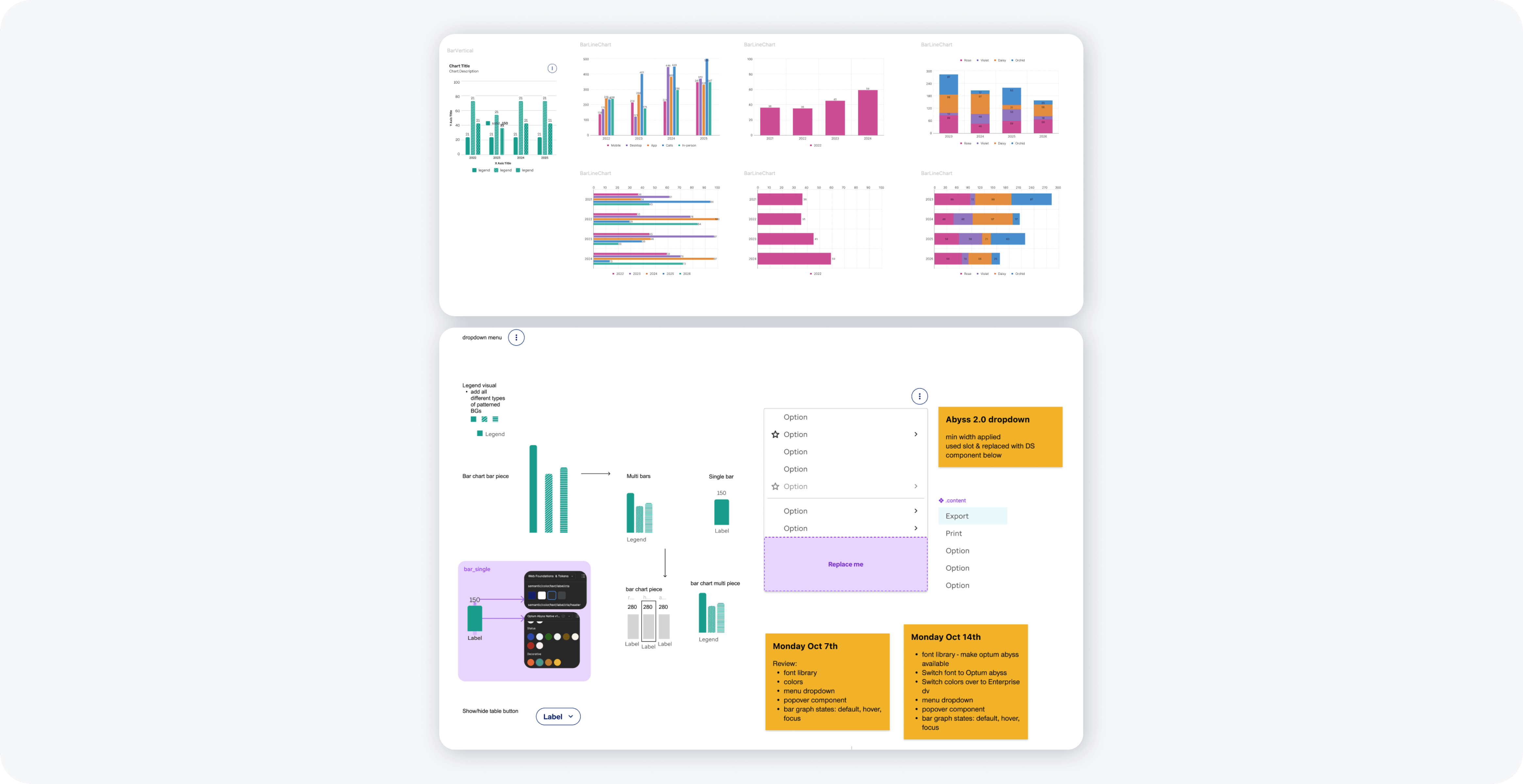
• Comprehensive documentation detailed component anatomy, color palette, interactive behaviors, and usage guidelines.
• Within 6 weeks, 75 product teams had adopted the bar chart component, reducing redundant work and enabling consistent, accessible data visualization across the organization.
Key Learnings
1. Strategic Prioritization & Roadmap Alignment: Advocating for this initiative highlighted the importance of proactive design leadership in aligning roadmaps with user needs.
2. Systemic Impact of Component Design: Accessible, versatile data visualization components improved comprehension and efficiency at scale.
3. Collaborative Innovation: Partnering with accessibility experts, engineering, and product teams ensured robust, widely adopted solutions.