ADT Motion System
Redefined ADT’s design language through motion, improving clarity, accessibility, and efficiency for millions of users.
Role
Led UX, Interaction Design, Research
Skills
Accessibility, Advanced Prototyping, Design Systems, Project Planning
Duration
Dec 2021 - Apr 2022
feedback Problem
ADT’s interfaces felt static and outdated compared to modern Google standards, creating a brand disconnect for users. We needed to implement a motion system that added delight without compromising accessibility for legacy users.
target Goals
• Modernize Brand: Inject purposeful motion that aligns ADT with modern Google aesthetics.
• Scalable Systems: Create a motion token system to reduce engineering friction and ensure consistency.
• Inclusive Design: Build accessibility-first timing and motion-reduction support into the core framework.
bolt Impact
• 1,400+ Hours Saved: Operationalized motion into reusable tokens, eliminating redundant dev workflows.
• Award-Winning Collaboration: Framework earned the 2023 Zeroheight "Best Collaboration" Award.
• Organizational Shift: Established motion as a strategic pillar, leading to ADT’s first full-time motion hire.
Background: Why Does Motion Matter?
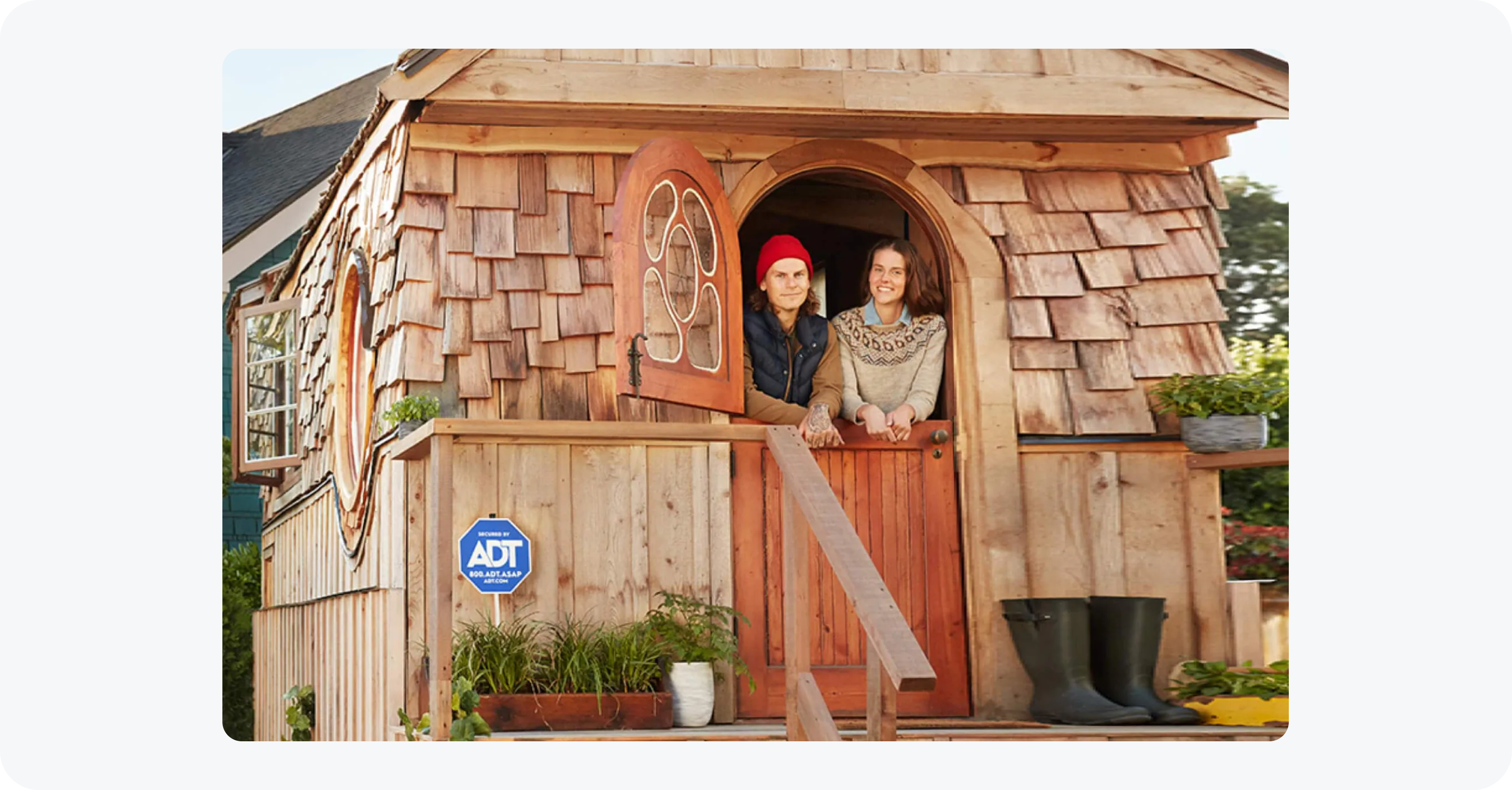
The ADT + app connects mobile devices and smart-home hardware, serving a diverse audience—from tech-savvy homeowners seeking sleek, modern interactions to legacy users relying on clarity and accessibility.
At the start of the project, the interfaces were visually static, missing the polish expected from smart-home experiences.
I saw this as an opportunity to add depth and engagement, introducing purposeful motion, to our design system and UI's, that enhanced usability and accessibility while reinforcing the high-design aesthetic of ADT’s partnership with Google.
I focused on high-impact, performant motion that delivered immediate value without compromising app speed or developer velocity.
Data-Driven Motion
I partnered with UX Research and Marketing to release a cross-demographic survey of 1,000 users (45.6% response rate) to understand motion needs and the kinds of apps and motion patterns users were familiar with.

The Benchmark: Users cited video streaming apps as the gold standard for interaction—directly shaping our strategy for camera feed transitions.
The Mandate: Motion wasn't viewed as a distraction; it was seen as a way to improve "perceived speed" and accessibility.
The Result: We moved forward with a motion system modeled after high-frequency utility apps to ensure immediate user familiarity.
Bridging the Demographic Divide
Interviews revealed that “static” meant different things to different users.
Younger users perceived static screens as slow and outdated, creating brand risk in a competitive smart-home market. Older users wanted motion as feedback — clearer visual cues for alerts and system states.
By reframing motion as a performance signal, not decoration, I aligned both needs and secured buy-in to evolve the design system toward a motion-first foundation.
Inclusive by Design: The Accessibility Framework
I championed a "safety-first" motion strategy to ensure ADT remained accessible to all demographics, specifically focusing on users with motion sensitivities—vestibular disorders, vertigo, migraines.
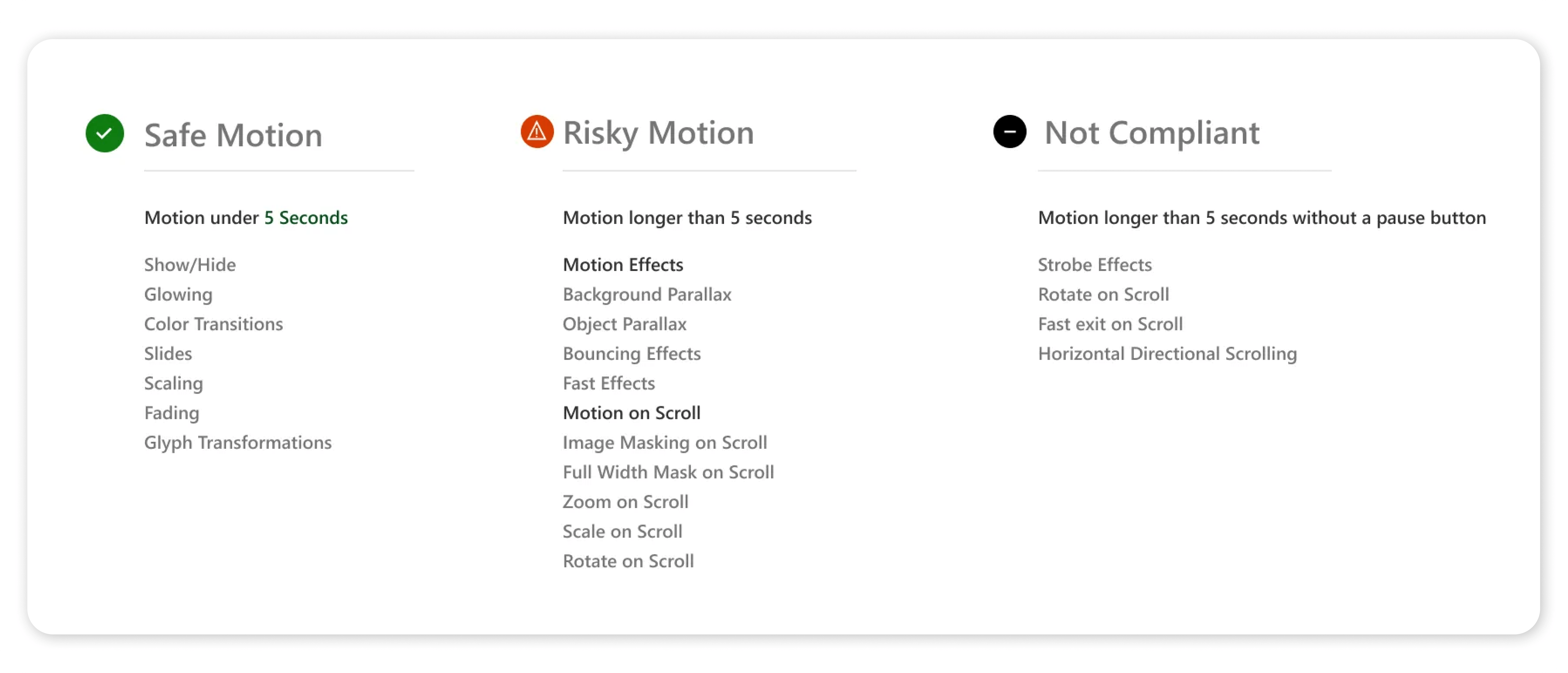
Motion Tiering: Developed a traffic-light system (Safe/Risky/Non-Compliant) to categorize animation types based on screen real estate, velocity, and flashing ratios.
System Integration: These guidelines were baked directly into the design system documentation, automating the decision-making process for engineering and reducing the risk of non-compliant releases.
Motion as Utility
To define a motion language that felt Google-native yet ADT-sturdy, I audited IBM Carbon and Google Material.
The focus shifted from animation as decoration to motion as choreography — purposeful, not performative.
This led to a Productive Motion framework, using 150–300ms durations to keep interactions fast, clear, and responsive.
Competitive Audit & Risk Mitigation
I reviewed SimpliSafe, Vivint, and Ring to understand where modern motion trends were breaking down.
Ring’s heavy parallax effects introduced friction for users with vestibular sensitivities, falling short of accessibility standards. Vivint, by contrast, used motion sparingly and with precision.
Rejecting decorative depth, I prioritized high-contrast, functional transitions — preserving a modern feel while protecting accessibility and legacy users.
Motion Foundations: Stakeholder Engagement
I defined motion foundations across design, engineering, and stakeholders, using clear do’s and don’ts with animated examples.
Principles covered included easing, overlap, relational motion, and entrance and exit behavior.
I prototyped the foundations as a live webpage, which helped secure buy-in and later became a featured resource in ADT’s Nebula design system on Zeroheight.
Design + Engineering Collaboration
Engineers were initially hesitant to implement motion due to workload and historical silos. I involved them early, using research and guidelines to simplify integration and demonstrate value.
Proactive engagement built alignment and buy-in:
Weekly stand-ups: Shared updates, findings, and addressed issues.
Bi-monthly demos: Reviewed prototypes and component builds.
Collaborative Workshops: Brainstormed and iterated together.
As a result, iOS and Android teams—once siloed—began proactively sharing their latest motion patterns via Slack with me, demonstrating the collaborative culture and momentum my leadership fostered.
Motion Tokens
To ensure consistency, I collaborated with engineering to standardize easing and duration across products.

Tokenizing motion not only kept interactions predictable but also streamlined future updates to the design system–standardizing easing and duration (mapping to CSS variables and JSON structures) across products.
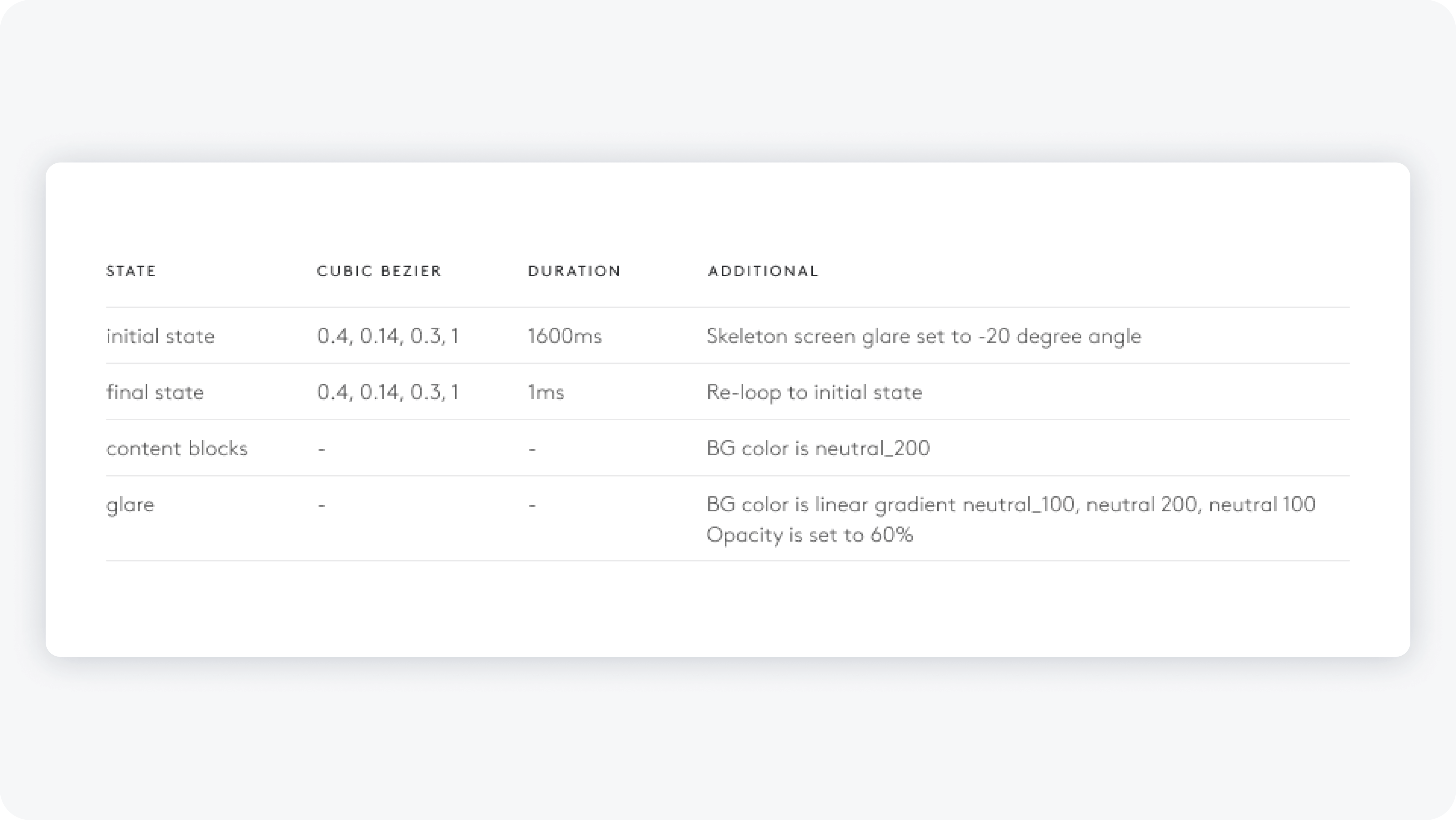
Motion Specs
To ensure high-fidelity implementation across iOS and Android, I authored detailed motion specifications for every design system component, defining easing curves, durations, and staggered delays.
These specs live with each component in the design system and serve as a reference, ensuring accurate QA.
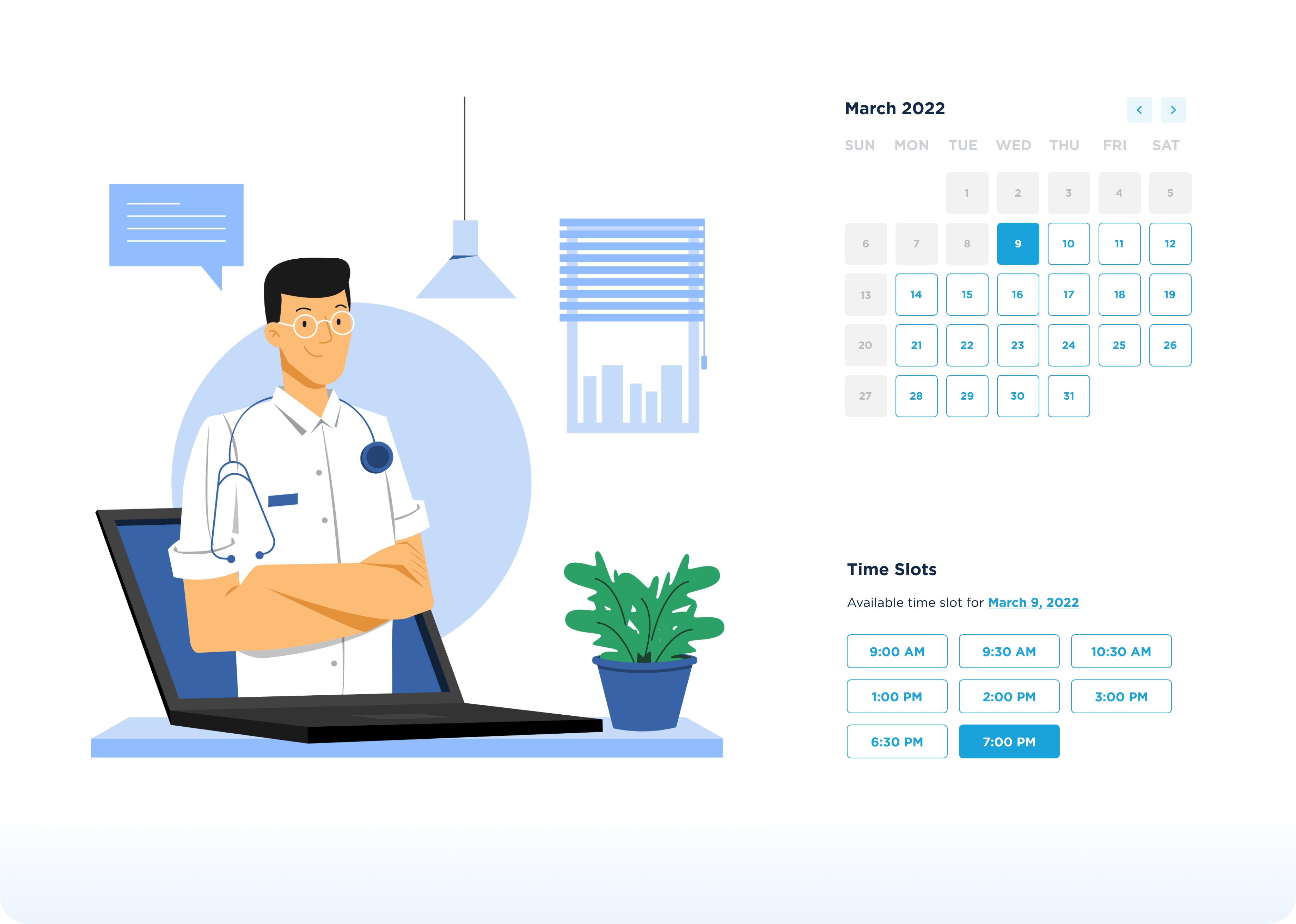
Keypad Component: Synchronizing with Hardware
The keypad was our first motion test. Beyond accessibility, I managed multiple animations and flash thresholds to ensure consistent behavior across mobile, tablet, desktop, and physical devices.
Collaboration with industrial designers aligned LED lights and timing, creating a seamless, cohesive experience.
Alerts That Get Noticed
For older users, soft spring animations highlighted important messages to prevent them from being missed.
For digital natives, quick swipe-to-dismiss improved efficiency and kept alerts from feeling sluggish.
Delightful and Accessible
Dynamic CTA sizing on tap created a tactile, engaging interaction while reinforcing task completion. It also alerted users to accidental taps, reducing errors—especially with camera 2-way talk.
User testing confirmed that participants appreciated the button’s responsive feel, describing it as more tactile and informative.
New Loaders for a Smoother Onboarding
This project introduced ADT’s first skeleton screens, or “Lazy Loaders,” as a reduced-motion loader for the Out-of-Box Experience (DIY system setup).
By utilizing skeleton screens, we improved perceived performance and reduced cognitive load during data-heavy state changes.
Google research also suggests this type of loader drastically reduces user frustration, making it ideal for first-time interactions. Iterative testing confirmed that users felt more informed, confident, and less anxious while waiting for content.
Tactile Feedback for Confident Interaction
To reduce confusion in complex smart-home systems, I added tactile touch points to confirm clicks. This improved reliability, supported task completion, and enhanced accessibility, especially for older users.
Reduced Motion for Accessibility
To ensure inclusive design at ADT, I implemented 'Reduced Motion' standards and play/pause controls for all high-energy UI animations and customer experience video, adhering to WCAG 2.1 guidelines for motion sensitivity.
Key Takeaways
1. Driving Design Influence
Early cross-functional collaboration not only secured buy-in for motion, it reshaped how Product, Engineering, and CX approach interactive experiences, creating a culture of proactive, research-driven adoption.
2. Designing for Diverse Users at Scaleg
Tailoring motion to distinct demographics revealed that delight and usability must adapt to cognitive and behavioral diversity — informing broader interaction patterns across products.
3. Strategic Prioritization in Complex Systems
By balancing user impact with technical feasibility, I delivered high-value features quickly, built momentum for iterative expansion, and set a framework for systematic motion adoption across the design system.
View More Work
United Healthcare Data Viz
Ibotta Earnings
ADT + Google Saved Media