Ibotta Earnings
A redesign of the Earnings feature to increase clarity of cashback rewards.
Role
UX design, content design, & user testing
Skills
UX strategy • Research • Content Design • Prototyping
Duration
Jan - Mar 2023
feedback Problem
As Earnings usage grew, transaction confusion led to a 15% spike in support tickets. Simultaneously, the experience struggled to drive engagement, falling behind competitors who utilized clearer, more motivating reward models.
target Goals
• Clarify Earnings: Simplify navigation to make cash-back status and transaction history intuitive.
• Reduce Support: Provide proactive, self-serve explanations, eliminating transaction-related confusion.
• Drive Engagement: Introduce gamification to motivate participation and increase offer redemption rates.
bolt Impact
• 8% Support Drop: Immediate reduction in Earnings-related Care tickets within the first 30 days of launch.
• 15% Higher Retention: Integrated gamified progress tracking, successfully reducing drop-off in the rewards funnel.
• 5% Referral Growth: Drove a measurable increase in organic referrals alongside higher overall feature engagement.
Background: Why Earnings Needed a Redesign
After a 2021 redesign, users reported growing confusion and frustration with the Earnings experience.
I led a content-first initiative to simplify a feature that had become bloated and difficult to navigate. Working closely with a Product Manager, Researcher, Engineers, and a junior designer, we focused on clarity, self-serve understanding, and reducing unnecessary complexity.

Understanding User Behavior
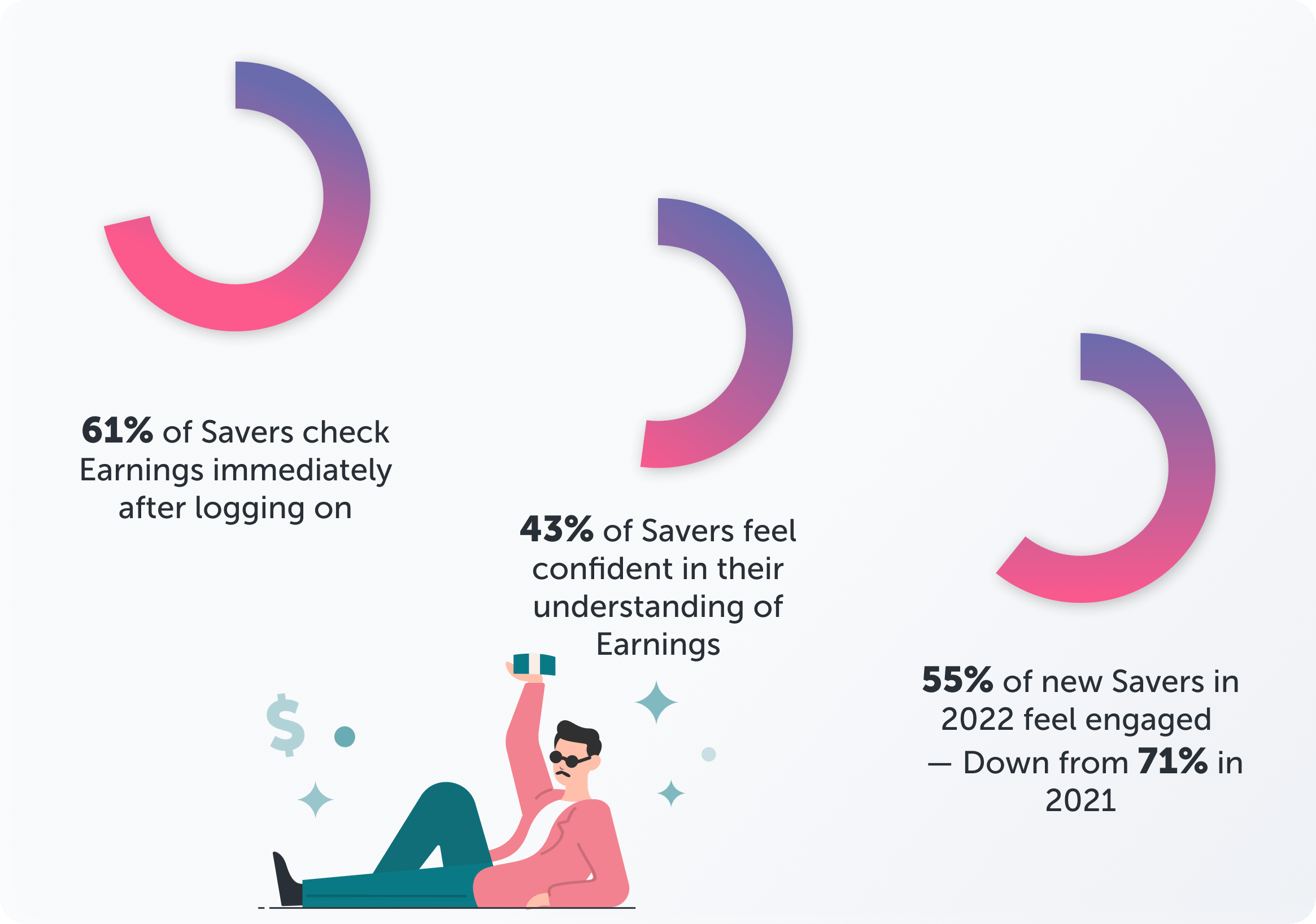
We received 526 respondents from a survey request of 2,000, and conducted interviews to understand how users engaged with Earnings. Insights revealed key frustrations: inefficient flows, underutilized features, and confusion around withdrawals.
Most users checked their earnings immediately upon login and often redeemed offers within an hour, highlighting the need for fast, clear access to essential information. These findings directly shaped our content-first redesign, ensuring the feature prioritized clarity, usability, and speed, while surfacing the most important actions upfront.
Where the Experience Broke Down
After reviewing research insights, I led a UX and content audit of the existing Earnings experience, benchmarking against best UX and content design practices.
The audit uncovered several critical issues: stacked CTAs creating choice overload, verbose labels that slowed comprehension, confusing hierarchy, and distracting design elements that obscured key data.
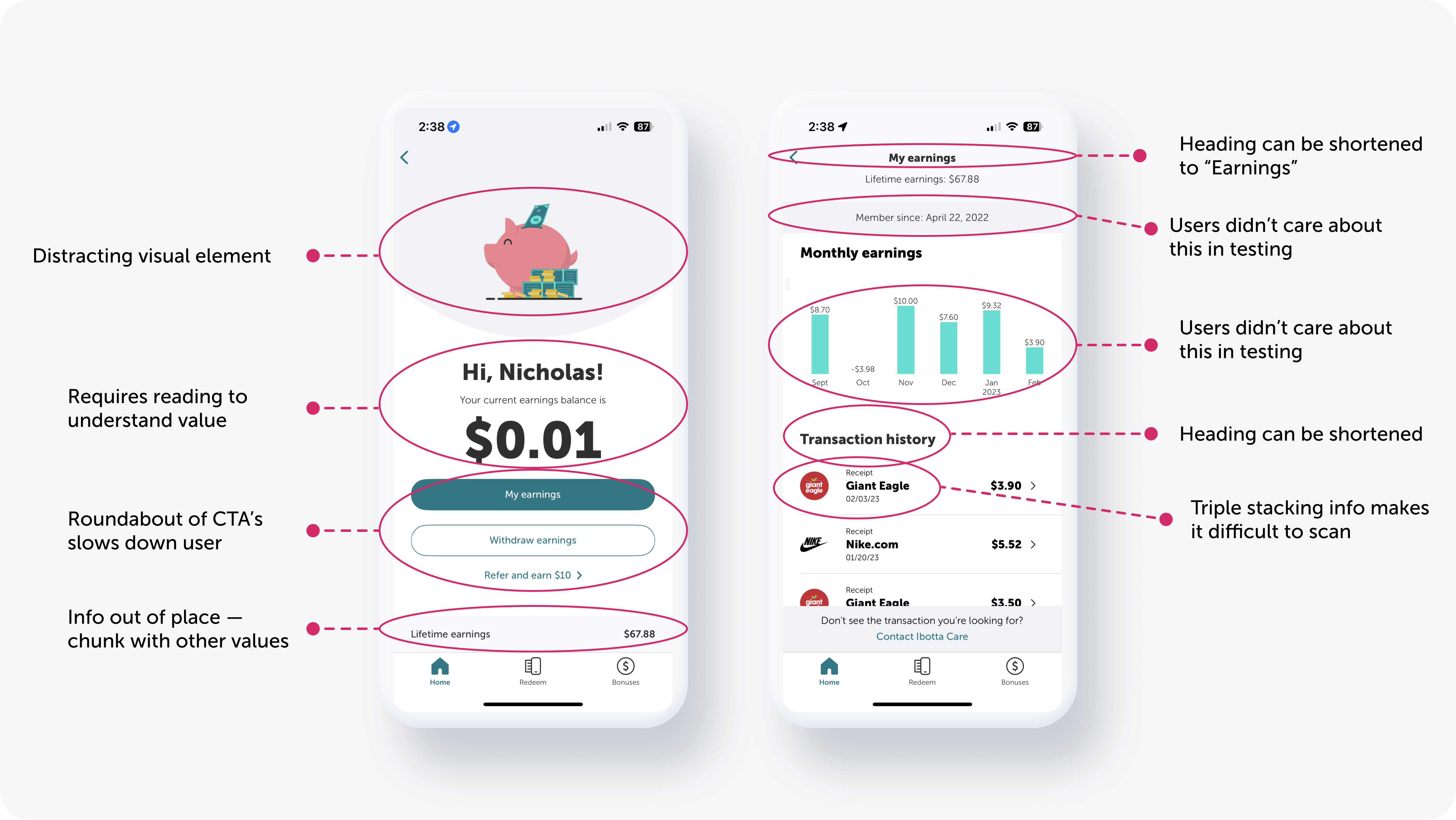
These findings helped define clear priorities for the redesign, ensuring that the next iteration would surface the most important actions and simplify the user journey.
Competitor Insights That Shaped Design
I evaluated competitors including Fetch Rewards, Rakuten, Receipt Hog, Capital One Shopping, and Ebates.
Insights revealed contrasting approaches: Fetch delivered gamified experiences but often lacked clear earnings visibility, while Capital One emphasized robust data presentation.
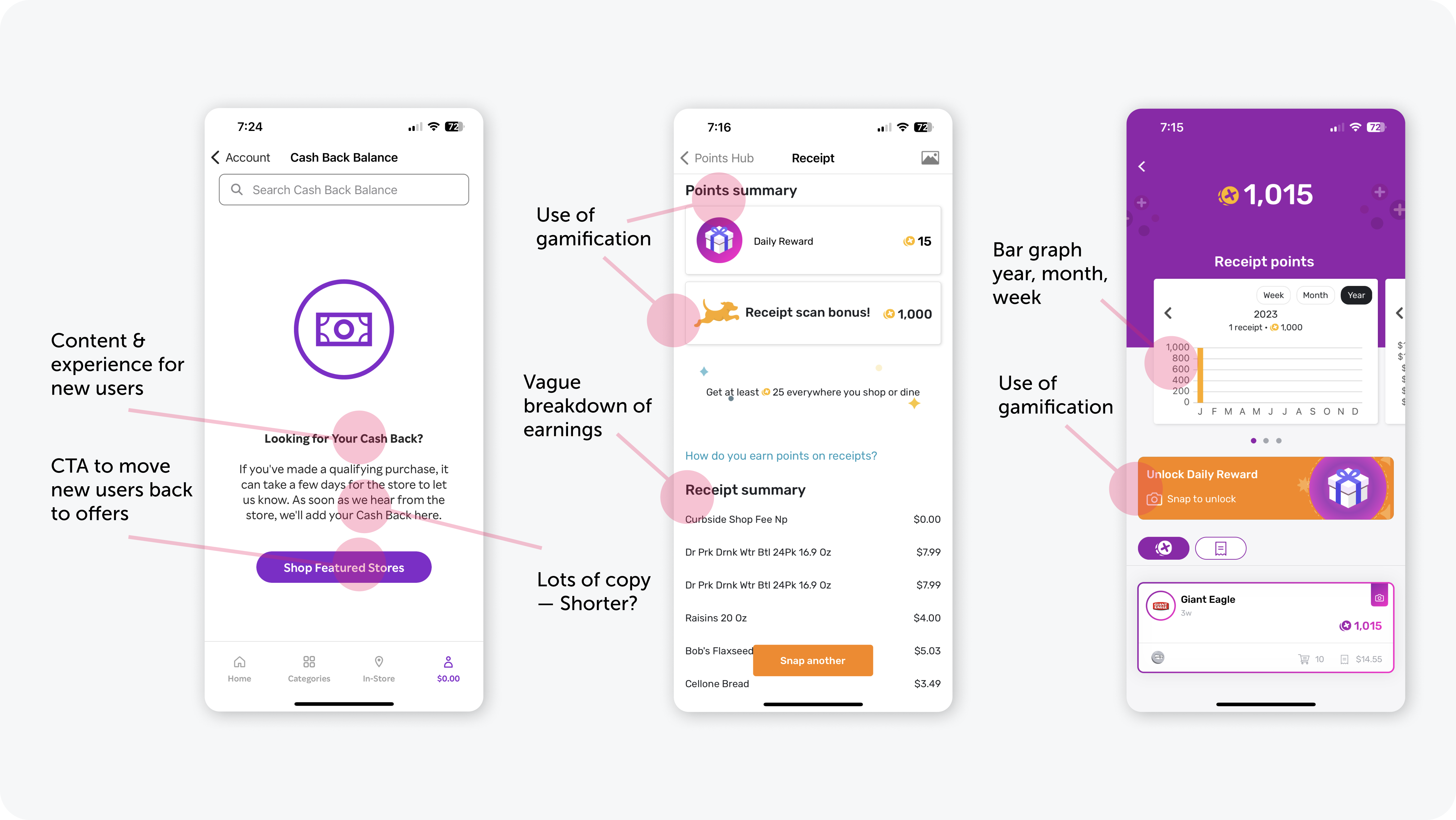
This highlighted an opportunity for Ibotta to differentiate by providing onboarding content and guidance for new users, reducing early confusion.
Additionally, Fetch’s leaderboard inspired a feature consideration for boosting engagement.
Design Lessons from Finance & Rideshare
To understand data-handling best practices, I examined financial, banking, and rideshare apps.
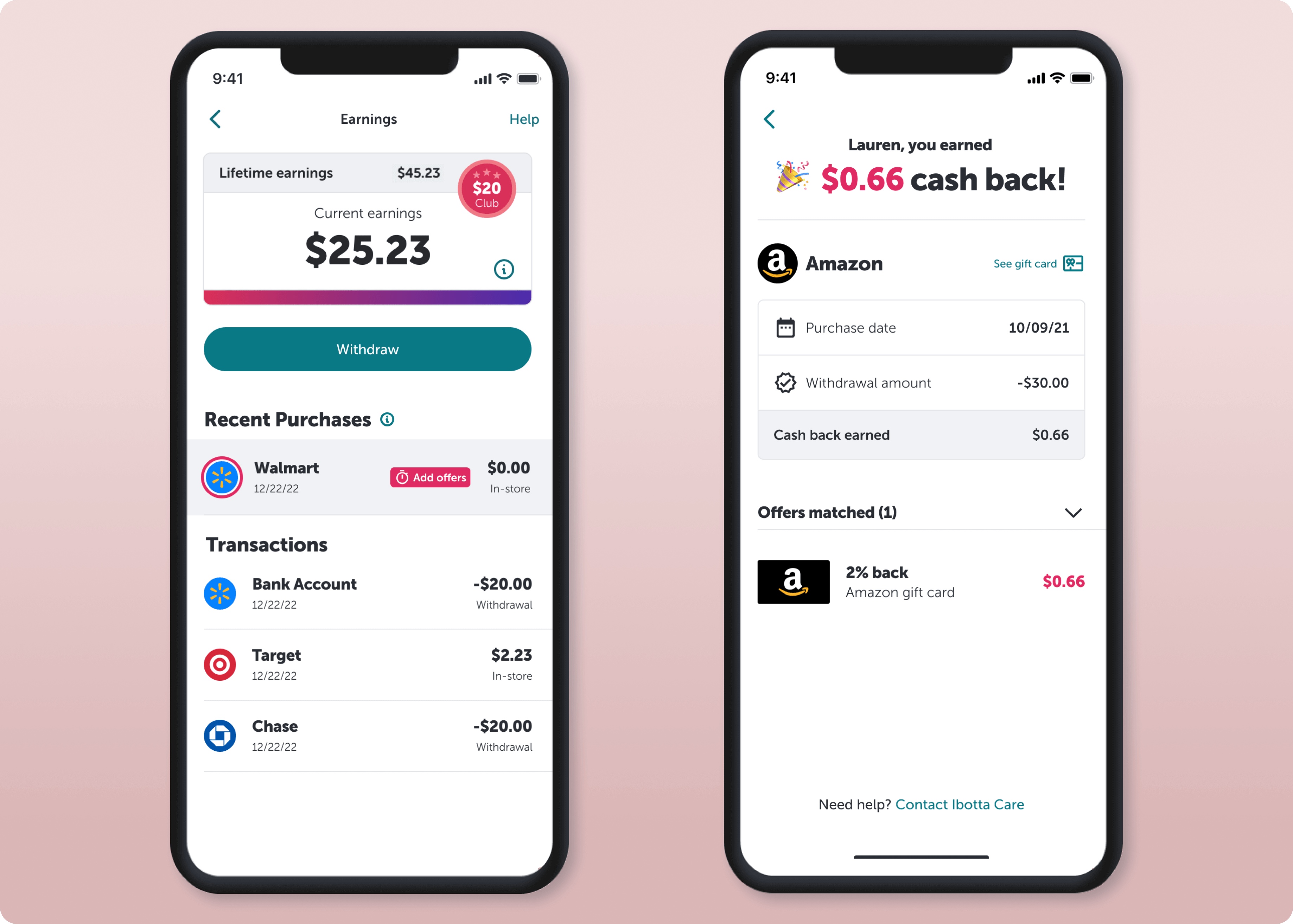
Patterns emerged around visual communication: effective use of infographics inspired a revamp of Ibotta’s bar chart and the addition of a progress bar to clearly indicate progress toward the $20 minimum withdrawal threshold.
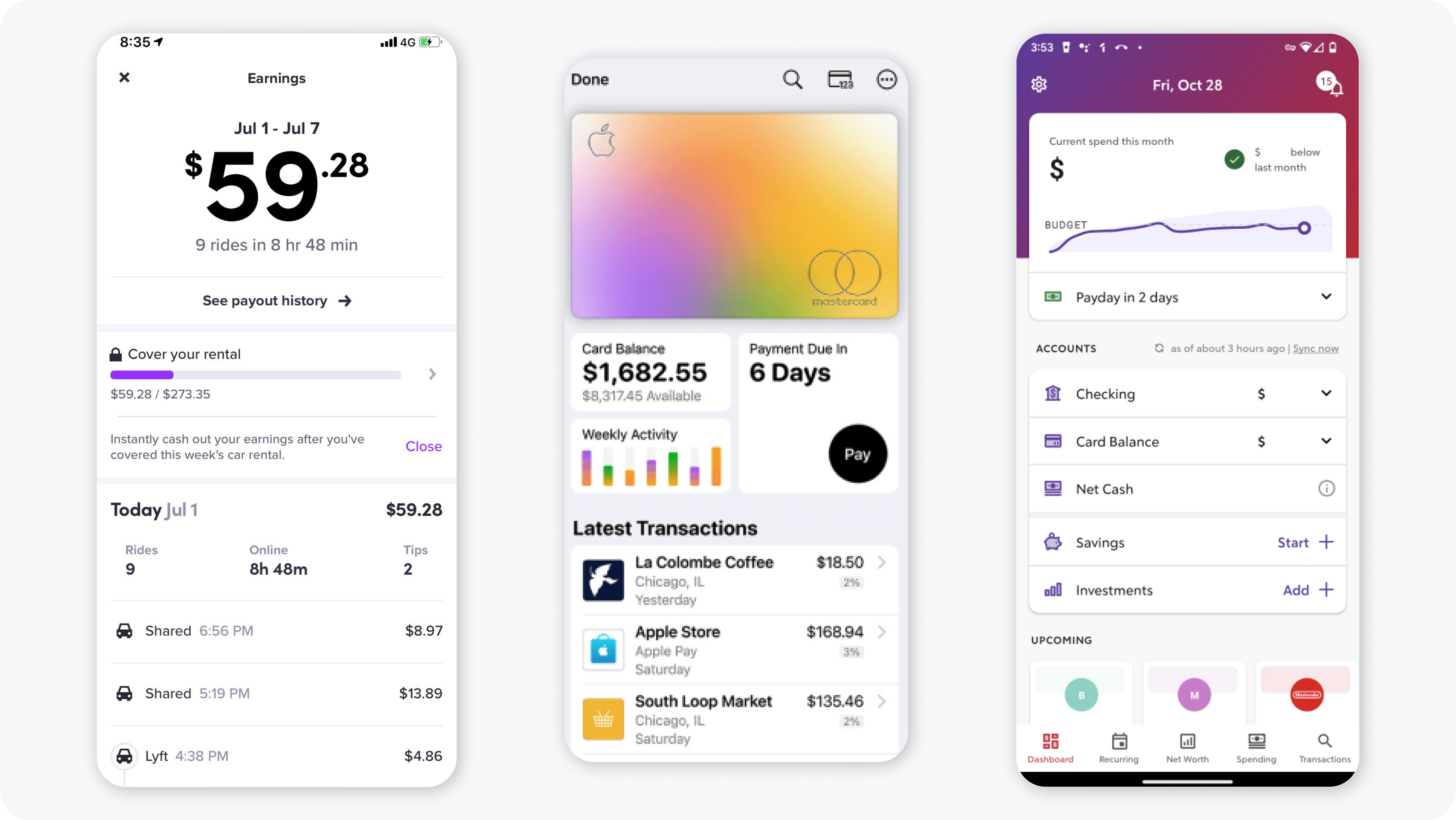
Another consistent pattern was immediate display of current financial status, followed by a detailed transaction breakdown, reinforcing the importance of
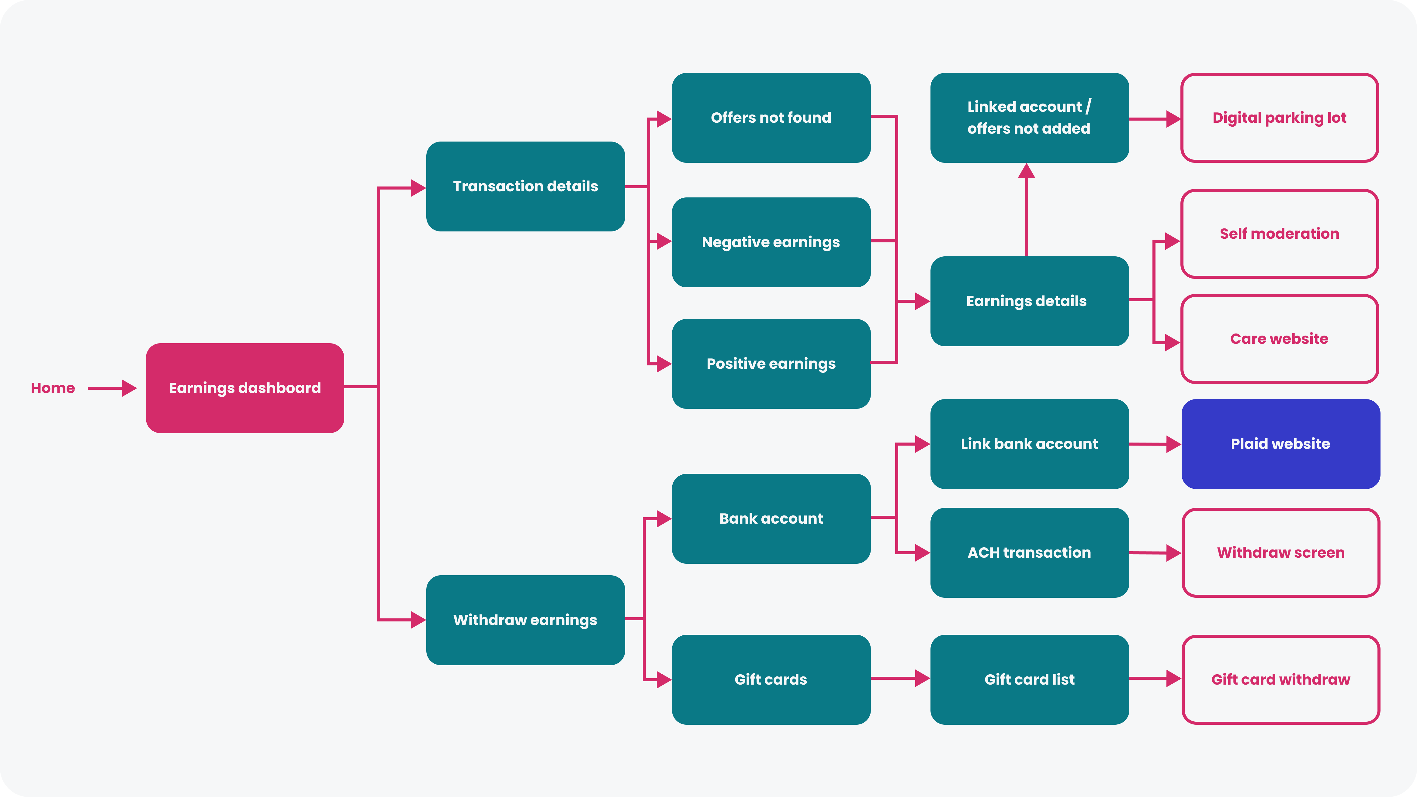
Streamlining the Earnings Journey
The previous Earnings experience suffered from too many screens, creating friction and slowing users down. I led a reductive strategy, mapping a new, streamlined product flow that eliminated unnecessary steps and simplified the user journey, ensuring that users could access key actions quickly and intuitively.
Rapid Ideation Through Design Bashes
At Ibotta, we ran Design Bashes—intense, collaborative sessions to explore concepts quickly. Partnering with a junior designer, we iterated through three 15-minute sketching and compilation rounds, then held a final 30-minute discussion to select the most promising ideas.
This approach allowed us to surface multiple directions fast, align cross-functionally, and move confidently toward the MVP.
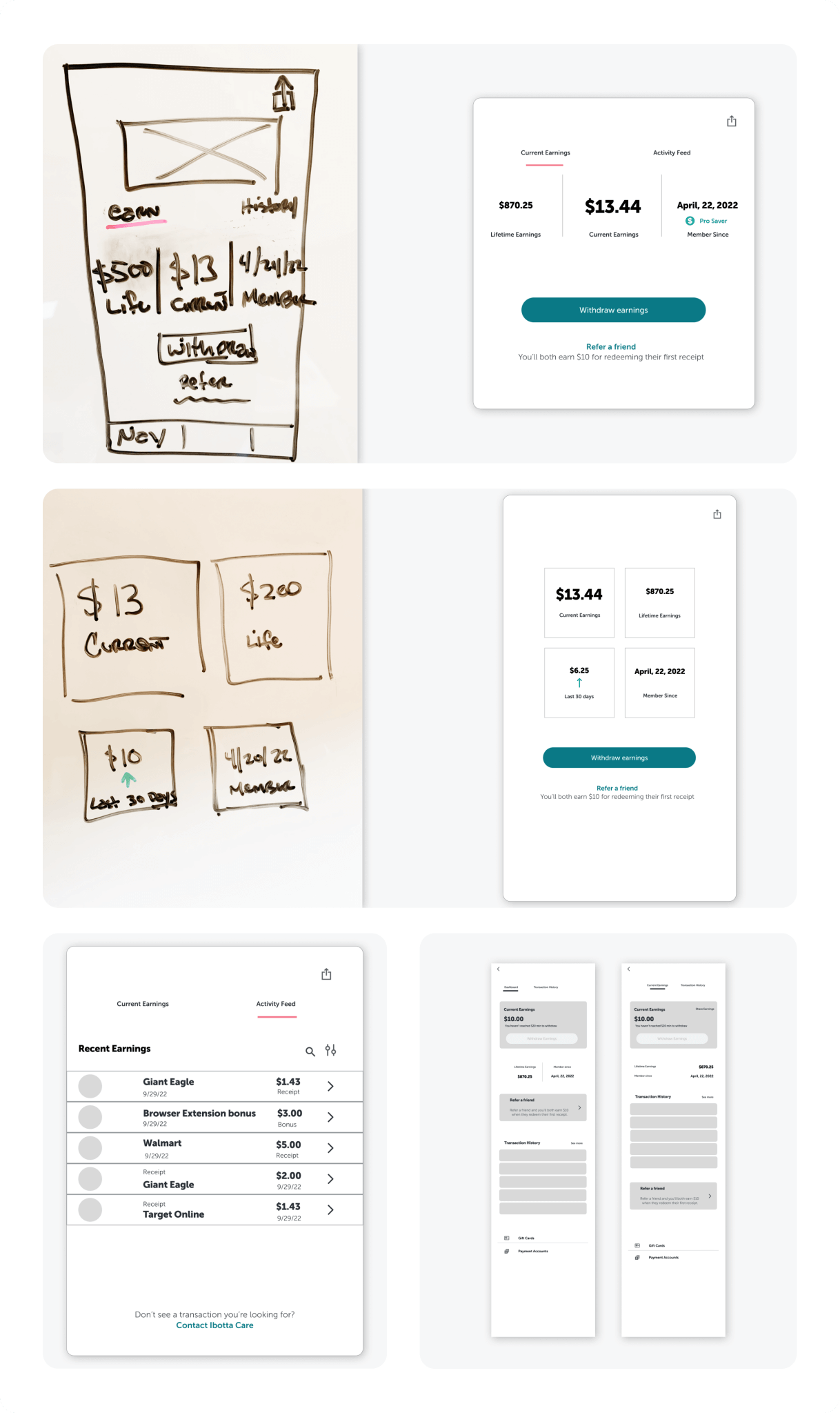
Validating Ideas Through A/B/C Testing
I created three distinct UI concepts for the dashboard view and ran qualitative A/B/C testing with 6 Ibotta users.

Users requested the graph redesigns from Verison A be placed in their 'Account Info' instead of Earnings. Version C won out, introducing top-earning badging to boost engagement. Insights from this testing guided the expansion and refinement of Version C into the final design.
Celebrate Progress with Earning Clubs
I designed Earning's Club overlays for $25, $50, $100, $500, $1,000, and higher tiers, giving users a clear, motivating visual of their progress. Users can tap a club chip to share achievements with friends, fostering friendly competition and social engagement, even while a full leaderboard remained out of scope.
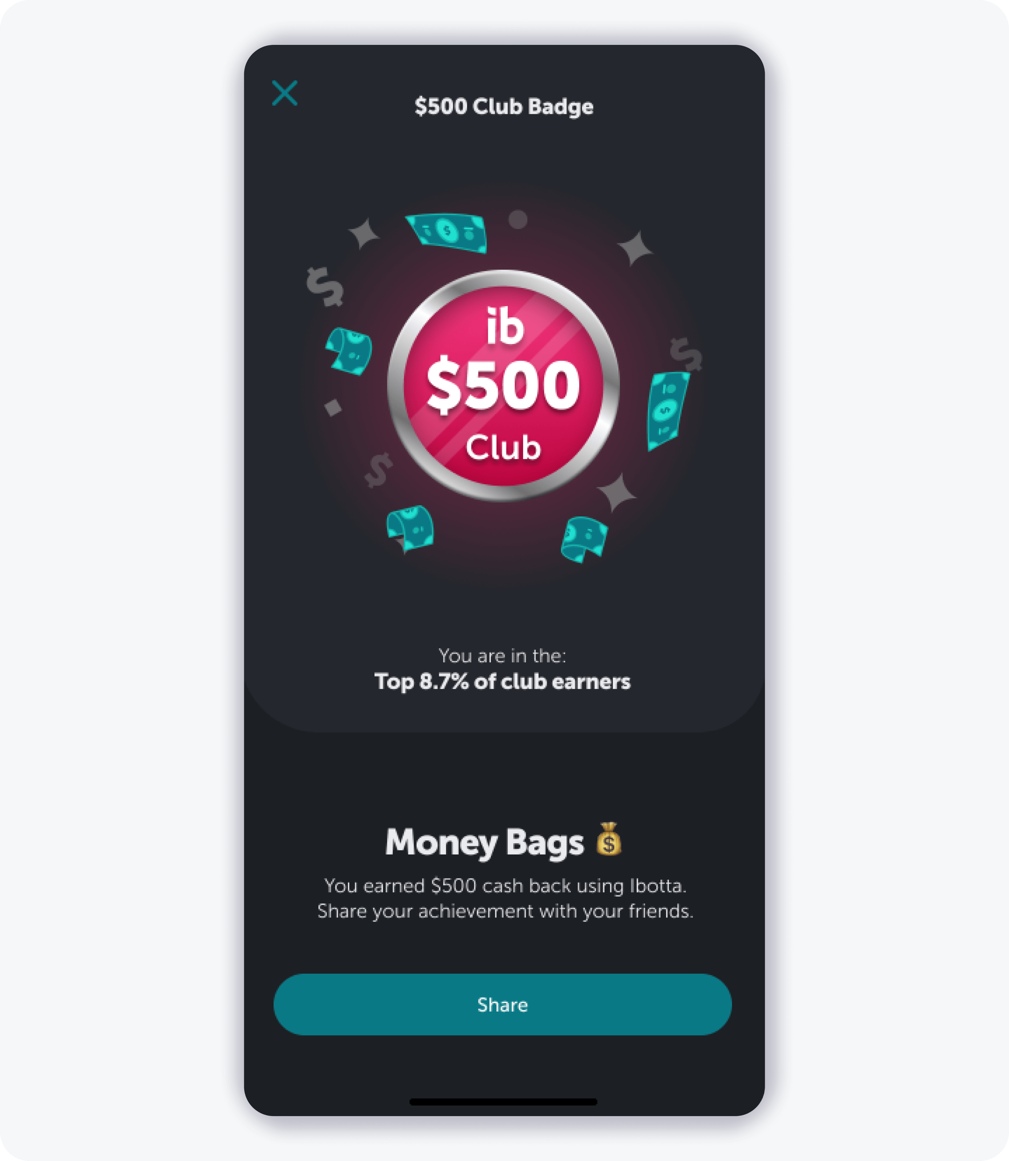
This was the first step in bringing gamification to Ibotta’s retail environment, encouraging users to earn more cash back and stay engaged.
Clearer Errors, Empowered Users
To reduce support tickets, I redesigned the Earning's error experience too, rewriting UX copy for clarity and simplicity and using bulleted lists to highlight actionable steps.

The result: the ‘Contact Ibotta Care’ link click rate dropped 20%in the first month post-release, empowering users with self-service solutions and improving the overall user experience.